Warm Neutrals or Cool Neutrals? Choose by the Surrounding Colours
Choose warm or cool neutrals by reading nearby colors first, then avoid muddy pairings and build a palette that supports your identity or layout.
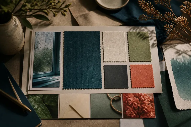
Warm neutrals or cool neutrals? The colors beside them should decide. A cream that looks calm beside rust can turn yellow beside icy blue; a gray that feels crisp with cobalt may look lifeless next to terracotta. Before choosing a background, paper, or interface surface, inspect the colors it must live with.
This relationship-first approach is useful in a logo system, a room-facing brand palette, a poster, or a web layout. It shifts the question from “Which beige is nicest?” to “Which neutral makes the surrounding colors feel intentional?”
Why does a neutral change beside another color?
Most neutrals carry a subtle bias. A warm neutral leans toward yellow, red, or brown; a cool one leans toward blue, green, or violet. Put that quiet undertone beside a stronger hue, and the contrast can make it more visible. The neutral has not changed, but your eye reads the relationship differently.
That is why a sample viewed alone can mislead. A pale gray may seem balanced on a blank screen, then read lavender beside a yellow accent. A soft ivory might look clean on its own but turn strongly golden next to a blue-green. Judge each candidate in company, not in isolation.
Keep the intended use in view, too. A large neutral field has more visual presence than a small swatch, and neighboring colors may be separated by a border, type, or material texture. Those details can soften or sharpen the contrast.
What usually goes wrong when the neutral feels off?
The accent looks dull. This often happens when a warm neutral sits beside a cool accent, or vice versa, without enough separation in lightness. The colors can seem to compete rather than support each other. Try a neutral whose undertone is closer to the accent, or change the accent’s lightness so the boundary reads clearly.
The whole palette looks muddy. Several subdued colors with different undertones can blur together: a gray-green background, a pinkish beige, and a dusty blue may each be attractive alone but feel indecisive as a group. Choose one neutral direction for the largest areas, then let a smaller, clearly chosen accent provide contrast.
The neutral looks too yellow, pink, or blue. A nearby hue may be exaggerating the opposite or shared undertone. Compare the candidate against a plain white sheet or a neutral screen area, then place the actual neighboring colors around it. If its cast becomes distracting in the real arrangement, try a less biased neutral.
Type loses clarity against the background. A warm gray and a muted green can blend even when both look legible as separate swatches. Check the actual text and background together, including small labels and fine strokes. If the pairing feels weak, adjust their lightness contrast or choose a background with a clearer undertone difference.
Materials clash with the palette. Uncoated paper, natural wood, brushed metal, and fabric can contribute their own color casts. A cool digital gray may feel stark beside warm paper, while a creamy neutral can make a cool metal look unusually blue. Bring material samples into the same view before settling the palette.
How can you choose a direction in order?
- Name the surrounding colors. List the hues that will sit next to the neutral most often: a logo accent, headline color, illustration, product material, or room finish. Include the colors that occupy the most visual space, not only the brightest ones.
- Describe their temperature loosely. Sort them as warm-leaning, cool-leaning, or mixed. A red can lean orange or blue; a green can lean yellow or blue. You do not need technical color terminology to notice the difference.
- Try one warm and one cool candidate. Put both beside the real colors in the intended layout. Use a few neighboring swatches, not a sprawling palette of near-identical choices.
- Check the whole arrangement. Look at the neutral as a field, then check the smaller details: lettering, thin rules, icons, and seams between materials. A pairing that works in a tiny sample may feel different when the neutral fills a page or panel.
- Choose the better relationship, then refine the shade. Once the warm or cool direction supports the surrounding colors, compare nearby options within that family. Adjust lightness and saturation to suit the composition rather than reopening the entire decision.
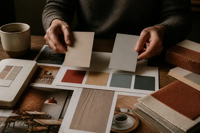
Say you are building a café menu around a brick-red wordmark and photographs of pale wood. You place a cool blue-gray and a warm oatmeal neutral behind the same sample menu. The blue-gray makes the red appear sharper but leaves the wood looking unusually orange; the oatmeal keeps the wood comfortable, yet dulls the red. You might then try a less yellow warm gray, expecting the wood to remain natural while the wordmark gains clearer separation. The point is not that warm always wins, but that the surrounding colors reveal what needs adjustment.
Which questions help settle the choice?
Should a neutral match the accent color’s temperature?
Often, a related temperature makes a palette feel cohesive, especially across large surfaces. A contrasting temperature can work when the layout gives the colors enough distinction in lightness and area.
Can warm and cool neutrals appear in one identity?
Yes, but give each a clear role, such as a warm print background and a cool interface panel. If both appear side by side without a reason, the system may look inconsistent rather than flexible.
How do I judge a neutral on a screen?
Place it directly beside the actual brand colors and review the composition on the kind of display where it will be used. Screen settings can shift color, so treat a digital view as a comparison tool rather than an exact match to print or physical materials.
What if the surrounding colors are mixed?
Start with the hues that dominate the composition or carry the identity, then let the neutral support those first. If warm and cool colors have equal importance, test a restrained neutral with a subtle undertone and use layout, borders, or spacing to keep the groups legible.
How should the palette change across formats?
A neutral may look different as a full-page background, a narrow label, or a strip of packaging. Large areas make undertones more noticeable; small areas can make them seem quieter, while nearby colors may still alter their appearance. Keep the palette’s roles consistent, but allow a related shade to suit a specific surface or format.
For a visual identity, record the chosen neutral alongside its intended companions rather than saving a swatch by itself. A quick reference can show the background, primary type, accent, and any material sample together. That gives a collaborator a more useful target than a color name alone.
When a neutral seems wrong, return to the surrounding colors before replacing it. The most useful warm-or-cool choice is the one that lets those colors read clearly and gives the composition a coherent feel. Make the comparison in context, and the right shade becomes much easier to recognize.