A Seasonal Color Board Built Around One Anchor Hue
Build a seasonal color board around one anchor hue, then assign supporting colors distinct roles for a palette that feels coherent without looking uniform.
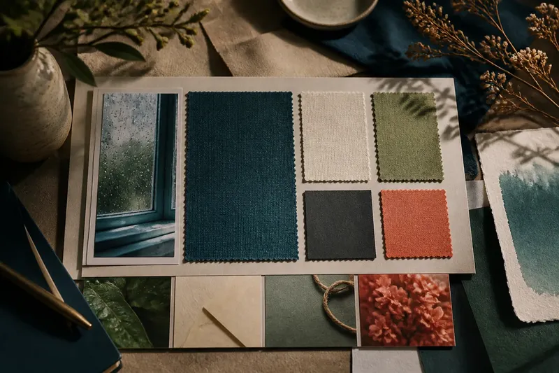
A seasonal color board works better when one hue sets the direction and the rest have clear supporting roles. Choose an anchor color first; then add colors that give it contrast, breathing room, and a seasonal mood without asking every swatch to compete.
What does an anchor hue do?
An anchor hue is the color that carries the board’s main impression. It might be the dusty blue of a late-winter sky, the leafy green of early summer, or a rust red that suggests autumn leaves without copying a familiar holiday palette. The point is not to make that color dominate every object. It gives the other choices a reference point.
Start with a specific cue rather than a season’s broad stereotypes. Look at a jacket you reach for, a market display, a patch of garden, or the light on a familiar wall. Note what the color actually is: muted or clear, warm-leaning or cool-leaning, light or dark. A named swatch or a photo crop can help you hold onto the character while you explore.
Keep the anchor to one hue family. A blue-green may be the anchor; a second unrelated blue chosen simply because it “goes with” it can blur the board’s direction. Variations in lightness and intensity are fine, but the main hue should remain easy to identify at a glance.
How do you choose the supporting roles?
Instead of matching each color to every other one, decide what the board needs the supporting colors to do. A useful set often includes a quiet ground, a contrasting accent, and a bridge color. These are roles, not a fixed number of swatches: the board can be small or expansive as long as each addition earns its place.
- Ground: A restrained color that gives the anchor room. It could be a soft cream, charcoal, or a low-chroma version of a nearby hue.
- Contrast: A color that makes the anchor easier to notice. Contrast can come from a difference in lightness, temperature, or hue family, not only from opposites on a color wheel.
- Bridge: A color that helps the anchor and contrast feel related. A muted green between a vivid blue and a warm clay, for instance, can soften the jump without making the palette uniform.
- Optional spark: A small, sharper note that adds energy. Include it only if the composition has a place for a brief accent.
Look at the relationships, not just the swatches in isolation. A pale ground may appear warmer beside a cool anchor, while a dusty accent can seem unexpectedly bright next to a dark one. The same color changes character as its neighbors change.
How should a seasonal color board be arranged?
Arrange the board to show hierarchy. Give the anchor a prominent swatch, then place the ground and bridge near it; set the contrast color where its difference is clear. You are not assigning exact coverage to a future design. You are making the palette’s logic visible so that a designer can tell which choice leads and which choices support.
Use samples with comparable visual weight. A tiny chip beside a large fabric photograph can make a color look more important simply because it occupies more space. Keep swatch sizes reasonably consistent, or label the role of an image that needs to be larger. If the board includes photographs, crop them tightly enough that incidental colors do not quietly become new palette members.
Say you are making a board for a spring stationery identity and choose a clear, slightly green blue from a rain-washed window as the anchor. You add warm ivory as the ground, soft leaf green as the bridge, and a small coral accent for contrast. On the board, the blue still leads, the ivory keeps the group open, and the coral reads as a brief interruption rather than a rival. If the coral takes over, reduce its swatch or replace it with a quieter contrast.
What should you check before adding another swatch?
Every new color changes the relationships already in place. Before adding one, ask whether it performs a role that the current palette lacks. If it merely repeats the anchor’s mood, it may be a variation of the anchor rather than a useful new member.
- Can you identify the anchor without reading a label?
- Does the ground leave enough visual quiet around it?
- Does the contrast color create a clear difference, or does it muddy the palette?
- Does the bridge connect colors without making them all look alike?
- Does the optional accent have a distinct job in the intended composition?
- Do incidental colors in photos or material samples pull attention away from the planned palette?
If one answer is no, adjust an existing swatch before adding another. A board with fewer, purposeful colors often communicates a stronger seasonal direction than a crowded collection of attractive but unrelated chips.
Which questions come up while building a seasonal color board?
Can a neutral color be the anchor?
Yes, if its temperature and character set the board’s direction. A smoky gray or creamy beige can anchor a palette, while a more vivid color supplies contrast.
Does every supporting color need to appear in the final design?
No. The board can show options for different uses, such as paper, type, or a small graphic accent. Keep the roles clear so that an unused option does not look like an accidental extra.
How many colors should the board include?
Use enough to show the anchor, its support, and any useful accent, then stop when another swatch has no distinct role. The right count depends on how much variety the identity or composition needs.
Should the board include material samples?
Include them when texture changes how a color reads, such as matte paper beside glossy packaging or woven fabric beside a flat digital swatch. Keep the material sample’s role visible, since texture can make a color feel lighter, darker, or more subdued.
How can the board stay useful across different formats?
A palette that looks balanced on a screen may shift on uncoated paper, fabric, or a painted surface. Treat the board as a set of relationships to carry forward, not a promise that every material will reproduce the same appearance. For a real project, check color specifications and material guidance with the relevant manufacturer or production professional.
Keep a short note beside each swatch naming its role and the quality that matters: “anchor—clear green-blue,” “ground—warm and quiet,” or “accent—small, lively contrast.” That note is more useful than a vague label such as “spring palette,” because it helps another person make a sound choice when a color must be adapted.
A strong seasonal color board is not a contest to find the most harmonious set of swatches. It is a clear proposal: one hue leads, other colors have jobs, and each relationship remains legible when the palette moves into a layout or material. When the board feels crowded, return to the anchor and ask what the next color contributes.