From Hand Lettering to the Modern Wordmark
From hand lettering to the modern wordmark, follow a fictional shop identity as its drawn name becomes reproducible without losing its voice.
A hand-lettered name can feel like it belongs to one particular window, sign, or package; a modern wordmark has to survive all of them. From hand lettering to the modern wordmark is not simply a story of replacing a brush with a font. It is a change in what the name must do: first make a distinct impression in one setting, then remain recognizable across many sizes and materials.
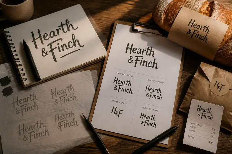
Consider an invented situation: Mara is opening a small neighborhood bakery called Hearth & Finch. She sketches the name with a broad marker for a paper sign, then realizes that the same identity must appear on a storefront, a bread sleeve, a social profile, and a narrow receipt. The challenge is not to make every version identical in texture. It is to decide which features carry the name’s character and which are incidental to the first drawing.
What does hand lettering contribute to an identity?
Hand lettering begins as drawn language. Each letter is shaped for its neighbors, and the word can be treated as a single composition rather than a row of interchangeable symbols. That freedom gives a mark a direct, particular presence: a tall capital can lean into a rounded lowercase letter, or a flourish can guide the eye toward the name’s ending.
For Mara’s first sketch, the marker leaves uneven edges and a lively change in stroke width. The ampersand sits close to “Hearth,” while “Finch” rises slightly above it. Those decisions make the name feel warm and informal. But the sketch also contains features that may not travel: a dry-brush edge, a thin connecting stroke, and spacing that works only because the sign is large.
That distinction matters. The original drawing is not automatically the identity in its most useful form. It is evidence of a voice: a record of the visual choices worth preserving.
Why did lettering become a reproducible wordmark?
As a name moves between surfaces, repeatability becomes part of its visual role. A hand-painted sign can be adjusted to fit its wall, but a package printer, a website, and a small label need a dependable master version. A wordmark provides that anchor: a defined arrangement of letters that can be reproduced without redrawing the name from memory each time.
Reproducibility does not require a generic result. A designer may refine a typeface, redraw individual letters, or adjust spacing so the final wordmark retains a distinctive silhouette. What changes is the relationship between mark and maker. The identity is no longer only one original gesture; it is a set of decisions that can be repeated by different tools and people.
For Hearth & Finch, that means the bakery’s identity must work when printed in one color as well as when displayed on a bright storefront. The mark should not depend on subtle paint texture to remain recognizable. Its letterforms and arrangement need to carry the name on their own.
Which parts of the sketch should survive?
Mara and her designer compare the marker sketch with several possible redraws. Instead of asking which looks most polished, they identify the traits that distinguish this name from a plain typeset label. They keep the rising “F,” the compact ampersand, and the slight contrast between the two words. They set aside the fragile brush edges and the tight spacing that could close up at small sizes.
This is a useful way to think about the shift from handmade lettering to a reproducible wordmark: preserve the visual decisions that communicate identity, not every mark left by the original tool. A brush’s irregular edge may be expressive on a large sign but disappear or blur on a small sleeve. A distinctive letter shape, by contrast, can remain legible when simplified.
- Letterform: Which letters have a shape specific to this name, rather than a decoration that could be removed?
- Spacing: Does the word still read clearly when the letters are reduced or printed with less detail?
- Silhouette: Can someone recognize the overall arrangement without relying on color or texture?
- Hierarchy: Do both parts of the name feel related while remaining easy to read?
- Material: Will the mark be printed, painted, cut, or displayed on a screen—and what detail can that method hold?
These questions turn a vague preference for “more modern” into specific choices. For the bakery, retaining the rising “F” does more identity work than retaining a rough edge that may vanish in reproduction.
How should one wordmark behave across different settings?
A wordmark does not need to look exactly the same in every application to feel like the same identity. It needs a stable core and enough practical flexibility to suit the surface. A wide storefront sign may use the full name, while a small stamp on a bread bag may need a simplified arrangement. The design problem is to adapt the mark without changing the features that make it recognizable.
Imagine Mara’s designer prepares a version for the bakery’s narrow receipt. They reduce the gap around the ampersand and remove a fine connecting stroke that becomes hard to distinguish in a small print area. The expected result is a compact wordmark whose letters remain readable, while the rising “F” and the relationship between “Hearth” and “Finch” preserve the bakery’s visual character.
Such adaptation should be deliberate, not improvised each time the name is used. A practical identity file can include the main wordmark, a compact version for constrained spaces, and clear guidance about when each belongs. The exact artwork and production requirements depend on the chosen type, printer, and display method, so the final files should be prepared for their intended uses.
What questions help judge the change?
Is a wordmark the same thing as a logo?
A wordmark is a visual identity built around the name itself, using arranged or customized letterforms. A broader logo system may also include a separate symbol, but the wordmark can stand alone as the recognizable name treatment.
Does a wordmark have to use a custom typeface?
No. A carefully selected typeface can provide a strong foundation, and a designer may customize only the letters or spacing that give the name its character. The useful question is whether the finished arrangement suits the identity and its practical uses.
Can a hand-drawn mark be used digitally?
Yes, provided it is prepared as usable artwork and remains clear at the intended size. Some hand-drawn marks need cleanup or simplification so that fine strokes and irregular edges do not become distracting on a screen.
How can a business keep a wordmark consistent?
Keep approved artwork in accessible files and specify which version belongs on which surface. Staff and suppliers can then use the prepared mark rather than recreating the name from a screenshot or an informal sketch.
When does the new mark feel finished?
Mara’s bakery does not need to erase its hand-lettered beginnings. The initial sketch remains useful as a reference for the identity’s tone, while the refined wordmark gives the name a form that can move from a storefront to packaging and digital displays. The transition succeeds because the design keeps the recognizable letter decisions and lets go of details that belong only to the first tool and surface.
For anyone considering the move from hand lettering to the modern wordmark, keep the original drawing beside the proposed artwork during review. Look for the few visible traits that make the name unmistakably itself, then check that those traits still read when the mark is reduced, printed simply, or placed in a new setting. That small comparison can keep refinement from sanding away the very character the identity was meant to carry.