The Alignment Myth: Why Every Edge Need Not Line Up
Intentional alignment in composition uses a few clear anchors and purposeful offsets to build hierarchy, preserve visual order, and avoid a rigid layout.
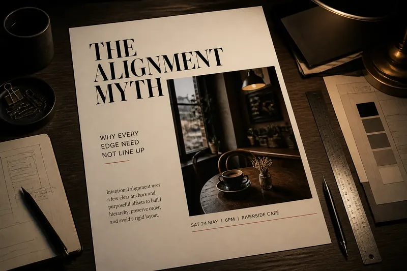
Intentional alignment in composition does not mean making every edge line up. A poster can pair a flush-left title with a photograph that begins farther in, or let a caption extend past the image, and still feel orderly. The difference is whether the offset has a visible purpose and a relationship to the rest of the layout.
Think of alignment as a set of agreements, not a rule that every object must obey. A deliberate exception can draw attention, create breathing room, or separate information. An unexplained exception just looks like a placement mistake. A week-long review routine can help you tell the two apart without immediately snapping every object to the same guide.
What makes an offset look intentional?
An intentional offset has a reason a viewer can sense, even if they cannot name it. The title may sit outside the photograph’s edge so it reads as the lead element rather than as part of the image. A small label may align with the photograph’s inner edge to mark a close relationship. Meanwhile, the main text column can keep a dependable left edge, giving the composition a stable anchor.
Order comes from relationships that repeat or clearly differ. If a title, body copy, and footer all begin at unrelated positions, the eye has to keep renegotiating the layout. But if two elements share an edge, one offset is easier to read as a choice. Contrast helps too: a large, obvious shift looks more deliberate than a tiny near-miss.
Before moving anything, identify what the layout should make a viewer notice first. That decision gives each alignment a job.
How can you review alignment over a week?
Use the routine below on a poster, identity sheet, presentation slide, or editorial page in progress. Keep the same composition throughout the week; the goal is to inspect it from different distances and with different questions, not to redesign it every day. A notebook sketch or a duplicate file lets you compare changes without losing the original.
- Day one: mark the anchors. List the edges that organize the page, such as the left edge of the text column, the top of the logo, or the photograph’s baseline. Choose only the anchors that serve the content, not every visible edge.
- Day two: name the hierarchy. Write down what should attract attention first, second, and third. Check whether the strongest alignment supports that order or makes a secondary detail seem like the main event.
- Day three: inspect each offset. For every element that misses an anchor, note its purpose in plain language: “separates caption from headline” or “keeps logo clear of image.” If no useful reason appears, try aligning it and compare.
- Day four: check the gaps. Look at the empty space around shifted elements. A deliberate offset often creates a distinct pocket of space; a near-miss can leave an awkward sliver that looks accidental.
- Day five: check the edges at different scales. View the layout at normal size, then as a small thumbnail. At thumbnail size, the broad structure should still read; at normal size, small relationships should feel considered.
- Day six: test one change at a time. Move a single element, then compare the result with the previous version. Avoid changing its position, size, and type style together, since that obscures which adjustment helped.
- Day seven: keep or undo. Review the versions side by side. Keep an offset if it clarifies hierarchy or creates useful separation; undo it if it weakens the anchors or attracts attention for no clear reason.
Say you are arranging a café event poster with a large headline, a square photograph, and a narrow date line. The headline starts at the page’s left margin, while the photo begins farther right; the date line then shares the photo’s left edge. If that shift makes the headline read first and groups the date with the image, it has a discernible purpose. If the date hangs between unrelated edges, move it to a clear anchor or make its relationship to the image more obvious.
Which edges deserve to stay fixed?
Not every edge carries the same weight. A long text column establishes a strong vertical boundary because readers use it to track lines. A logo’s edge may matter because it needs clear space. A decorative shape, by contrast, may be free to cross an invisible column if doing so directs the eye rather than disrupting the reading path.
Look for the few edges that organize the content: the start of the main text, the top of a headline group, or the boundary between image and copy. Treat these as anchors. Other elements can align to them, align to one another, or intentionally depart from them. The useful question is not “Does this edge line up?” but “Which relationship should this edge explain?”
In a grid-based layout, the grid is a reference, not a cage. A pull quote may cross a column boundary to create emphasis, while the body text stays within its measure. The crossing feels controlled when the quote has enough room and the surrounding text still reads cleanly.
How do size and spacing change the effect?
An offset cannot be judged separately from scale. A tiny shift between two large, parallel edges may look like a printing slip. A wider displacement can read as a clear hierarchy move, especially when another feature—such as a shared baseline, color, or repeated spacing—connects the elements.
Spacing provides another clue. If a label moves away from a title, the gap should help distinguish the label, not leave it stranded. If a photograph shifts right, consider whether the open area to its left can hold the headline or whether it simply becomes dead space. The aim is not symmetry; it is a composition where each gap and alignment contributes to reading order.
When an offset feels uncertain, compare two versions: one with the elements aligned and one with the shift made more decisive. A clear contrast is easier to evaluate than a series of tiny nudges.
What alignment questions come up most often?
Should every text block share the same left edge?
No. A consistent edge can steady the main reading column, while a title, quote, or caption may shift to mark a different role. Keep the departure visibly connected to an anchor or make its separation purposeful.
When does an offset look accidental?
It often looks accidental when the difference is slight, isolated, and unsupported by spacing or another relationship. Try aligning the edge, or increase the offset enough to make the choice legible.
Can a layout use more than one alignment system?
Yes, if each system serves a clear group of elements. A poster might use one anchor for its text column and another for image captions, while shared spacing and hierarchy keep the groups from feeling unrelated.
How do I judge alignment on a small screen?
Check the design at the size where it will actually be seen, not only while zoomed in. If the main hierarchy survives and no edge seems to drift without reason, the composition is likely holding together at that scale.
When should you leave a deliberate exception alone?
Leave an offset in place when it helps the viewer distinguish roles, trace a reading path, or connect elements that should be read together. It need not match every other edge to belong. It does need a clear relationship to the composition’s anchors, spacing, or hierarchy.
That is the useful test behind intentional alignment in composition: preserve enough order for the eye to feel oriented, then let selected elements step away from the grid. A controlled exception can give a layout character; a stray near-miss merely asks the viewer to wonder what went wrong.